|
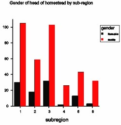
Exploration & description/Age and gender of head To create a bar chart to compare ratios of genders of homestead heads across sub-regions we start, with the original spreadsheet selected, by pressing Graphics → Create Graphs...→ 2-way Barchart. Click 'Create Table' in dialog box that is shown, and then 'Groups' in the next small dialog box that appears, followed by 'OK'. Enter factors 'Subregion' and 'gender' under 'Selected Groups' and click 'OK'. The original dialog box then reappears with 'table' in the 'Data:' box. Click 'Next' and enter a title to produce the output as shown. Across all the sub-regions, there were more homesteads with male heads of homesteads than there were with female heads, and this was perhaps more so for Sub-region4 and Sub-region6 than it was for the other sub-regions.
|
![]()
![]()
![]()